Projects / 01
Superstore KPI Dashboard in Power BI
An interactive executive dashboard built in Power BI. I reshaped a flat file of 9,994 order line items into a star schema with explicit DAX measures, then put a clickable report on top so questions like "how are we tracking against last year" take seconds to answer instead of hours.
- Power BI
- DAX
- Power Query (M)
- Data Modeling
- Data Visualization
Try it: the live dashboard
How I built it
Raw transaction data does not answer business questions. The Sample Superstore dataset is one flat table of 9,994 order line items, with no structure and no measures, so a sales leader looking at it cannot tell whether the business is growing, which regions carry the revenue, or where margin is leaking. I built this dashboard to turn that flat file into something a leader can actually use, where those questions take seconds to answer instead of hours.
So, basically, the build has two halves. First I reshaped the CSV in Power Query into a star schema: one fact table at order line grain, surrounded by five dimensions (Date, Product, Customer, Location, and Ship Mode). Location had no natural key, so I built a composite key from five columns. The date dimension is a DAX calendar table marked as a date table so time intelligence works correctly. Then I wrote every measure as explicit DAX. Total Orders uses DISTINCTCOUNT because the fact table is at line item grain; a plain COUNT would have reported about 9,994 orders when the true number is 5,009. Year over year growth runs through CALCULATE with SAMEPERIODLASTYEAR, and I validated it by confirming each year's prior-year sales matched the year before it exactly.
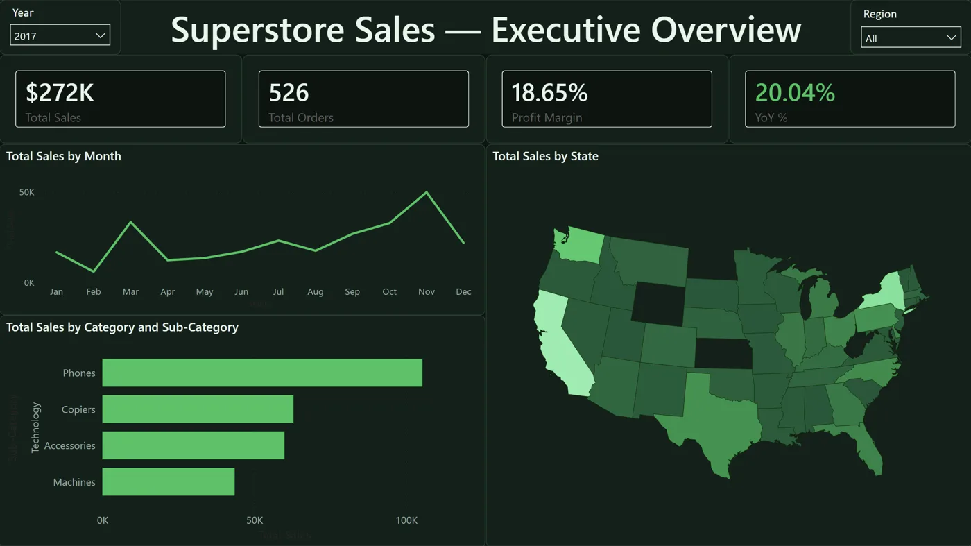
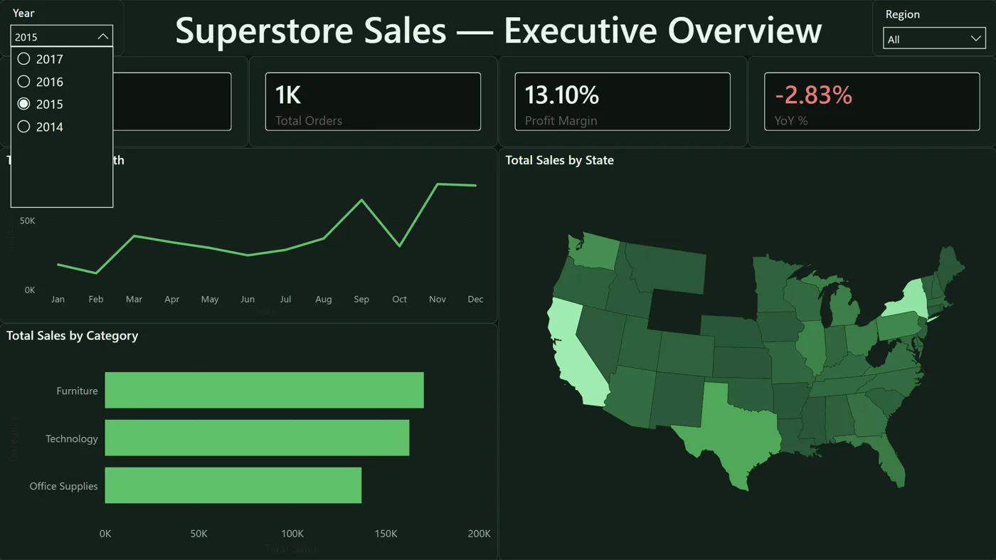
The report gives you four KPI cards (Sales, Orders, Profit Margin, and YoY %), a monthly trend, category bars that drill down into sub-category, and a US state map, with year and region slicers filtering the whole page. Click any state or category and everything else cross-filters, so you can go from "revenue is up 20%" to "because Technology in the West is up" without writing a query.
Finding the connections in the data is my favorite part. Sales grew 51% from 2014 to 2017. 2015 was the one down year, but profit margin actually improved from 10.23% to 13.10%, and selling less at better margin is a very different story than a simple revenue dip (a single revenue KPI would have hidden it). California and New York alone account for roughly a third of all revenue, and sales ramp seasonally into a November peak.